People.Health
Industry
Services
A rebrand that works smarter — so healthcare teams can, too
With its workflow automation platform, PEG was on a mission to help healthcare teams spend less time on admin work and more time on people. But, to break through the noise and reach the right organizations, PEG needed more than great technology — it needed a brand transformation that matched its ambitions.
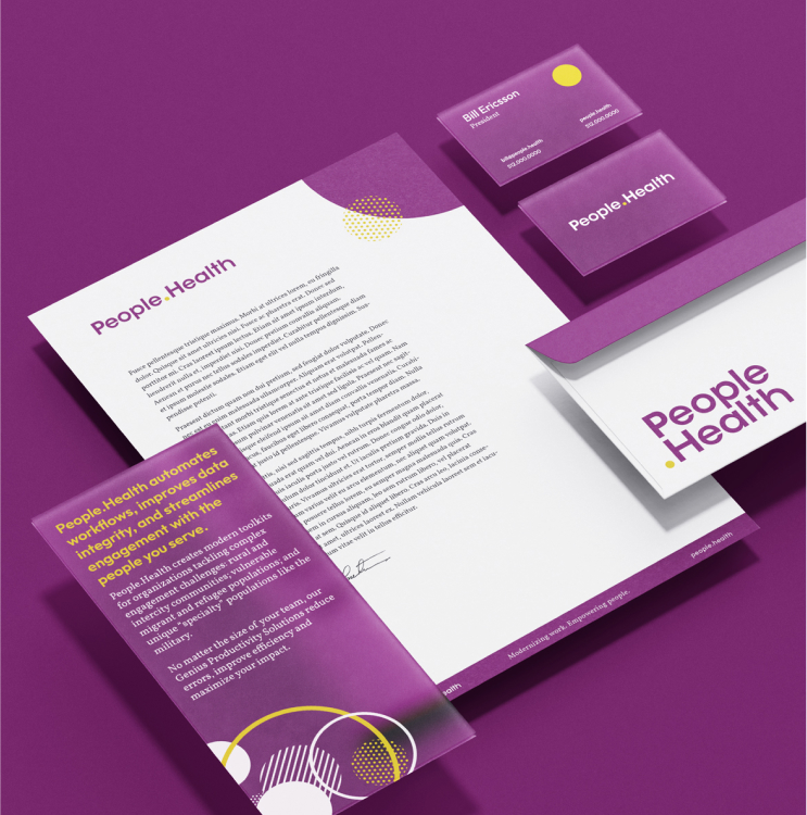
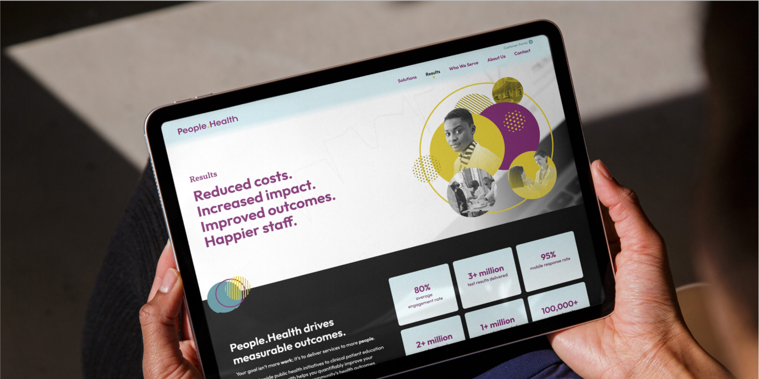
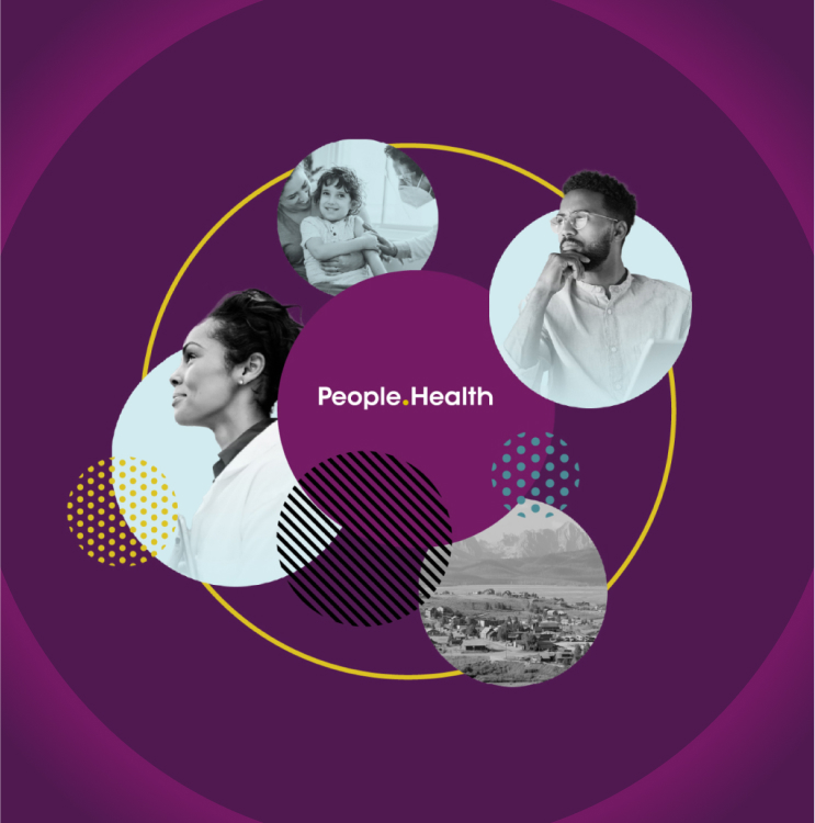
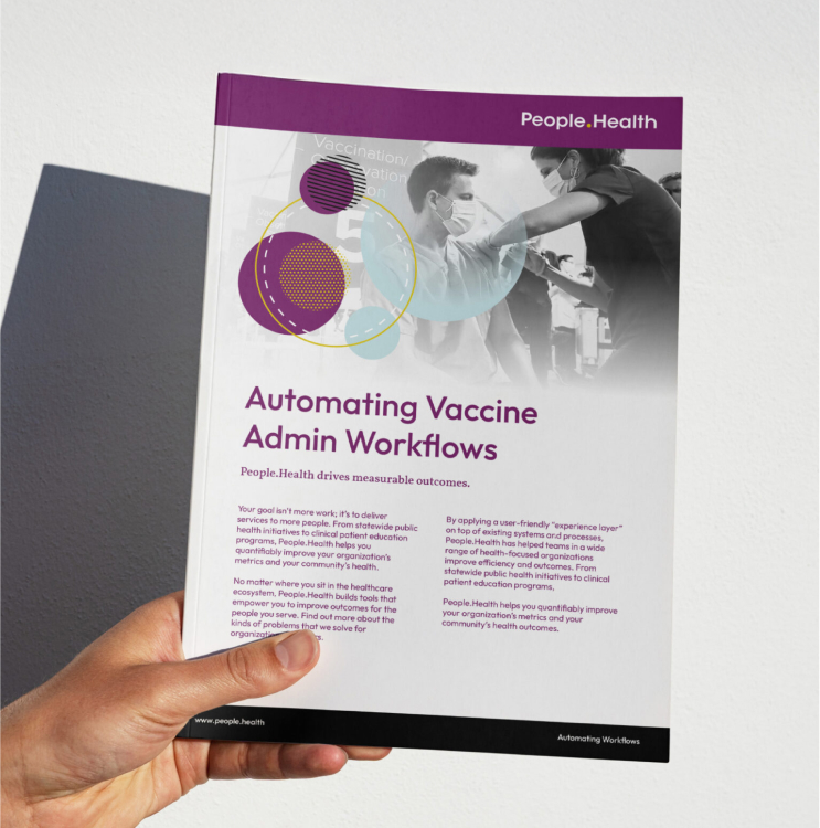
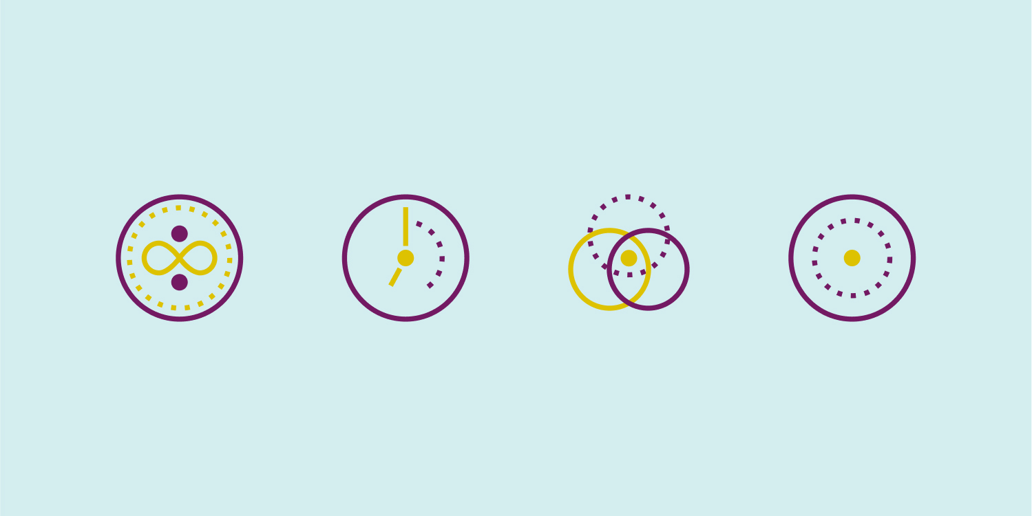
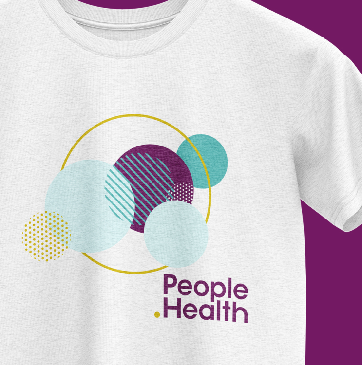
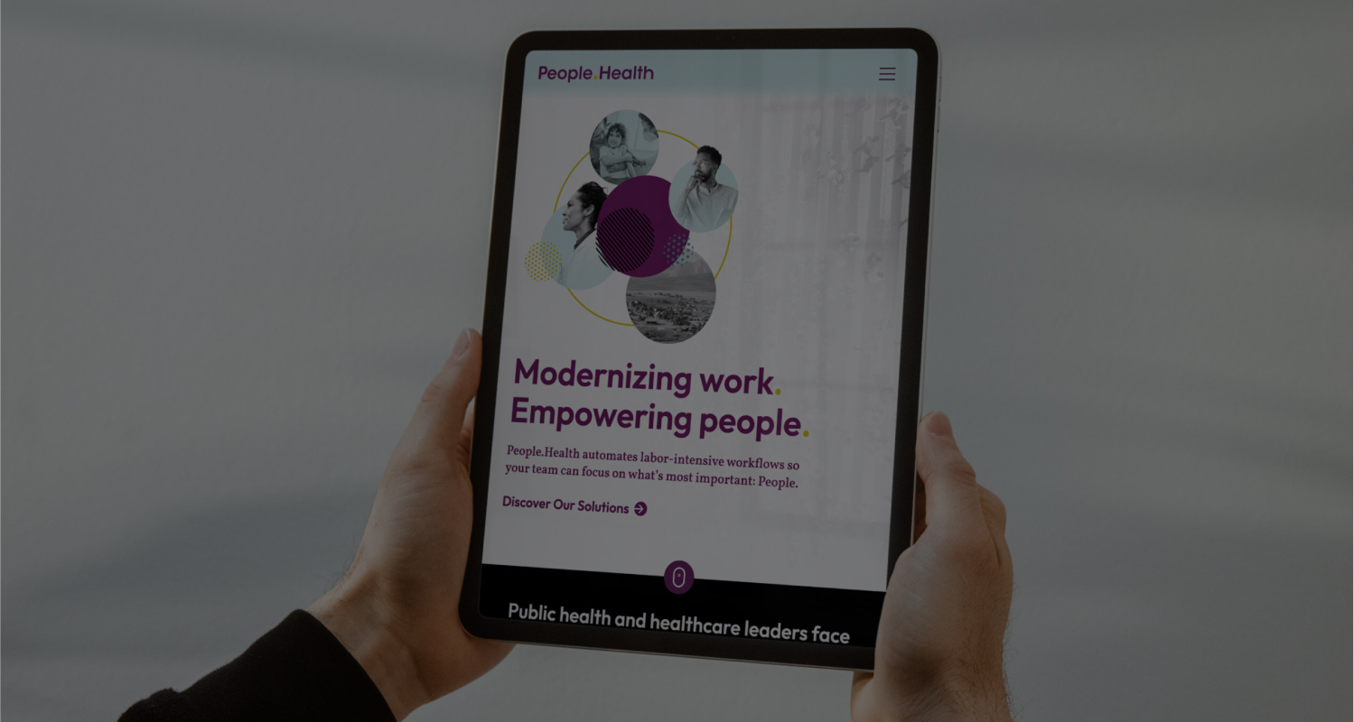
PEG approached us to help them build a brand that captured its people-first vision and forward-thinking impact. We started with a new name — People.Health — followed by an overhaul of its messaging, visual identity, and digital presence. A circular design theme symbolizing an interconnected ecosystem reinforced its commitment to comprehensive solutions — and holistic care. The result? A brand that looked and felt as innovative as its platform.
The rebrand catered precisely to the demands of People.Health’s market. Within a year, the company was leading large-scale health management efforts for world leaders like the City of New York, the City of Detroit, and the State of Michigan. Its bold identity and a digital presence continues to power growth and extend reach, making People.Health a go-to leader in healthcare workflow automation.